
Highlights from my time at
1892 Design System
In 2017, I was part of a large cross-functional effort to establish a design system at Abercrombie & Fitch. I led the design effort to capture our patterns and translate them into standard components with all the developer leads on our team.
Timeframe
2017 - present
Role
Sr. UX Designer -> Sr. Design Manager
(Design Lead and eventually Design Manager)
I first did an interface audit across the experience to collect what visual styles we had in place and start to look for patterns that would inform our component index.
This also helped us establish a baseline to compare to after we had completed the design system.

I then created a component collage in a wireframe format to help align on what justified a unique pattern vs what should be merged into one.
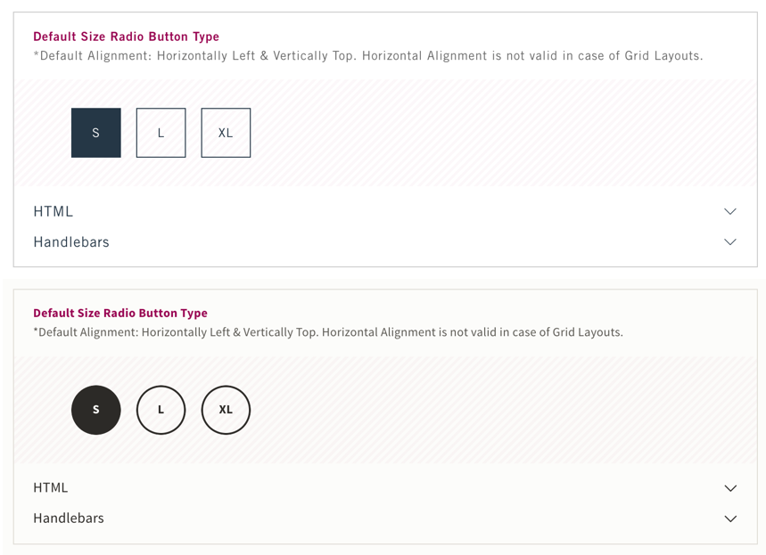
We used the Atomic Design principles established by Brad Frost to categorize our components.


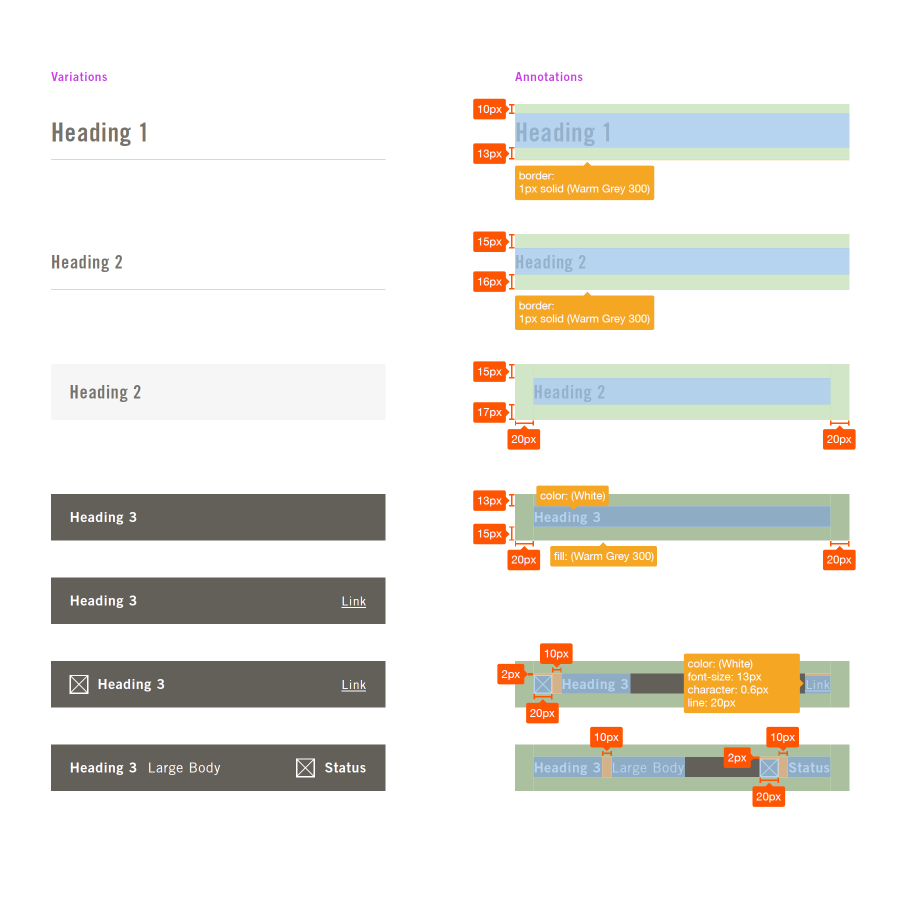

Establishing a Style Guide enabled the team to communicate to the rest of the organization the proposal for components and begin to measure the effort to build them. As part of that evaluation, we decided to bring in an industry expert to guide us down the right path to build our design system.
We had the privilege of bringing in industry expert, Brad Frost, to guide us through steps for forming our design system. It was a fantastic experience for the teams which ended with a design system site created and our first components built.

We spent a little over a year building out every component and implementing them across our web experience for our customers. This process was an amazing learning experience as we built and implemented at the same which helped us learn quicker about what worked and what didn’t. While it wasn’t the easiest method, I think it turned out to be the best for our team in the long run as everyone contributed to the process.
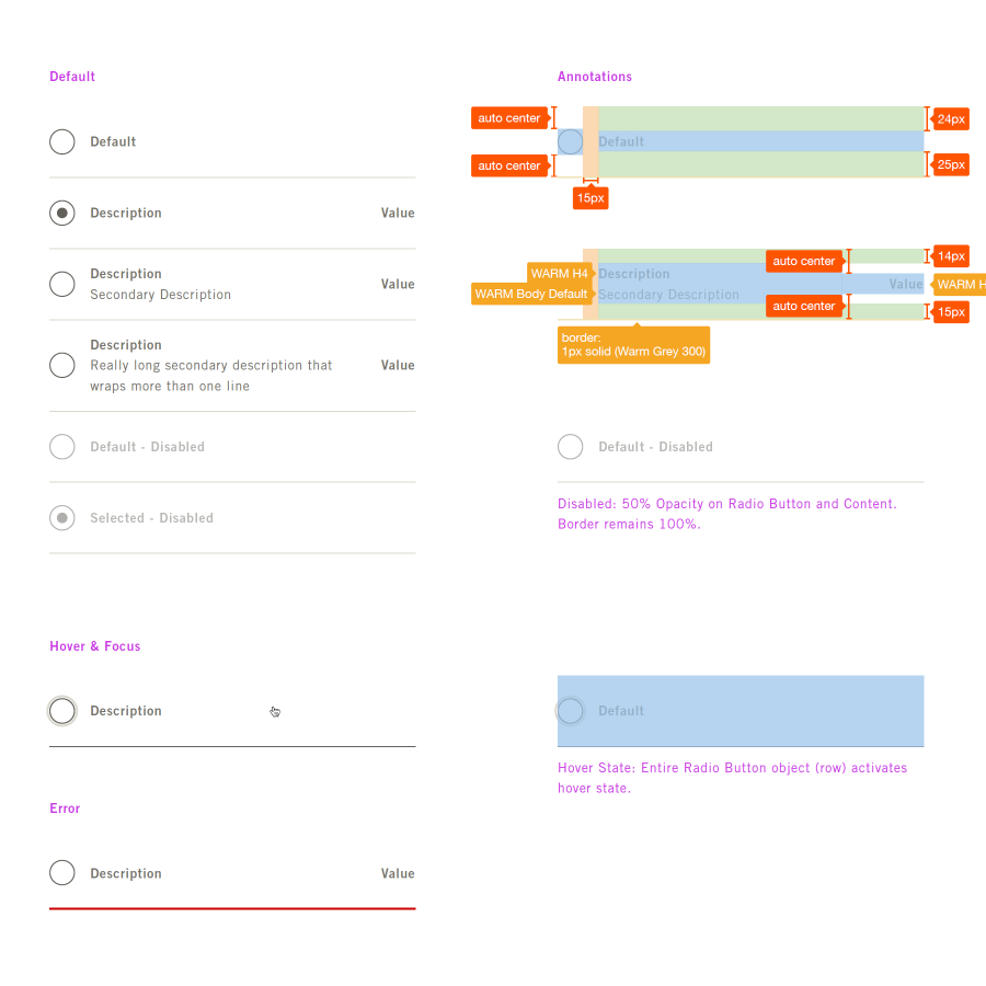
We made sure to build all our components to WCAG 2.0 spec to form an accessible foundation. It also helped ensure our components were built with industry standards, making integrations easier.
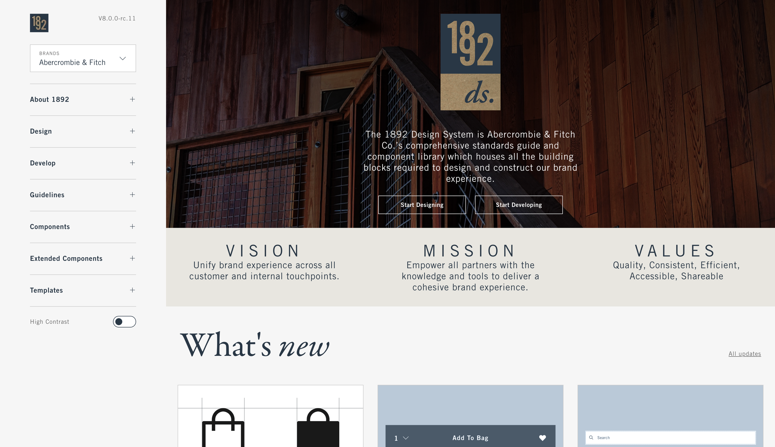

1892 started by supporting 3 brands, but over time we added more to support a total of 7 brands. Each brand uses the same underlying component structure, using design tokens and functions to style the components uniquely.

For 6 years the 1892 design system has powered A&F’s main ecommerce web experience. In more recent years we made major progress in adopting our marketing patterns and supporting other channels. Design tokens enabled us to easily add more brands, along with updated design kits.


Our design kit was built utilizing Sketch from the beginning and we updated it over time with design changes, new components, as well as new functionality supported by Sketch. It was utilized by our entire Product Design team as well as some engineering partners.


Near the end of 2019 I became the Design Manager for the Design System. I led the team in overhauling the Hollister brand styles, and adding 4 brands to the system. The time to make such changes went from months of work before the design system, to only a few weeks with the design system. During that process we migrated towards using Design Tokens utilizing SCSS functions to abstract most design properties to a token that could be branded.
Our system requirements were very unique in that some brands could be rendered in the same context as another brand (ie, Gilly Hicks on the Hollister website) which required us to use functions to support a brand attribute on components.
Design Tokens have become one of the most critical functions of a design system. They empower designers to directly control the visual language of the system with little to no effort on the engineering side. Tokens also enable far more adaptability within systems around branding, theming (dark/light mode), and scaling interfaces for different channels/use cases. Tools such as Tokens Studio and the NEW Variables in Figma are transforming the industry at a rapid pace. Including the draft of the W3C Standard.


Through my leadership position I established a governance meeting cadence to maintain a working relationship with consumers of the design system and incorporate change management. Over time we released several major version upgrades but as the system matured that cadence was less frequent.
While the technology side of our system had matured, we began evolving the documentation and content to support more teams. I formed roadmaps and planning sessions to evaluate the path forward for maturing our system. That effort included leading a UX copywriter in collaboration with brand copy partners to begin establishing voice and tone guidelines. We also partnered with the Product Design team to align on design tenets for the organization. It was an incredible opportunity to form and maintain a design system for a major clothing retailer like Abercrombie & Fitch.
Components
Over time as a lead in the Design System project an the manager of the Design System design team, I designed or led a team to design new components, replacement components, or variants of existing components. This process varied greatly depending on the needs of the component and the impact to existing implementations.
I created a standard decision tree and contribution model that helped organize and manage the design process through execution.
Timeframe
2017 - present
Role
Sr. UX Designer -> Sr. Design Manager
(Design Lead and eventually Design Manager)
Cards


Card components are pretty common in design systems and usually have some sort of frame around a specific set of content. At A&F before the design system all these component types were aesthetically different and had varying methods of achieving similar functions.
With Design System we defined common properties and synchronized them through tokens, naming conventions, etc. Some Card use cases were merged into one Card type, Rewards Cards and Promotional Cards were merged into one Discount Card with minor variants to support the unique treatments.

Bordered Variant
Boxed Variant
For years the Product Card had remained independent of any Card tokens and was less structured due to the complex variations to support a variety of use cases. The Checkout team needed some updates to support new features and approached the DS team to provide the overall direction and foundation for a standardized Product Card.
I led the effort to organize the process while my direct report went through an exhaustive effort to capture the use cases and gather benchmark examples. Through collaborations with designers and alignment with the DS engineers, we arrived at standard version of the component for bottom of the funnel use cases (Mini Bag, Bag, Checkout, Account).

We also developed a Content Card to support basic content types, especially needed for the Corporate Website.
Connected to the other Card components through Tokens, this version is the style for the A&F Corp. brand.
Tiles
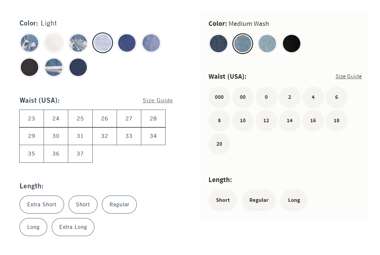
In the early stages of the 1892 Design System, all the Tile type components were apart of one component called Tile Input Group. While this worked early on, we found over time that the variations required enough difference in behavior and styling that the component became difficult to manage and change. Especially after we launched several new brands, it became apparent that the desired state of each variant required a separate component.

I led the design exercise to re-evaluate the original component wholistically and define the best design pattern for each required Tile component. The main 2 Tile components were Swatch Tiles and Size Tiles.
The Swatch Tiles had a selected state that only change an outer border, and they were always to be circular in shape. For the Size Tiles, the Selected state was filled, required a wide (pill) variant, and always showed the label inside the Tile. This justified making them separate components with some common approaches to implementation and layout.
Separating the components also enabled our engineering team to more easily compartmentalize changes across brands for the overall aesthetic of the component.
Throughout my career leading the Design System at A&F I led the team in adding new components, updating existing ones, etc. This required thoughtful alignment with teams all across the organization as well as planning for release cycles and implementation teams. Some components such as an Add to Bag widget were used for testing and were a more straight forward addition to the library. Other components such as the Product Card, Tiles, and Headline component (for Marketing) were far more complex that required long term management and design processes to succeed in their delivery.
Libraries & Design Kits
Throughout my career at A&F, creating and managing libraries was a key responsibility for myself and the design system team. Libraries unlock the potential for designers all across the organization to create experiences easily while aligning to the standards of the design system.
Timeframe
2017 - present
Role
Sr. UX Designer -> Sr. Design Manager
(Design Lead and eventually Design Manager)

Copy based components and buttons built in Sketch. I built the early versions of the design kit at A&F with Sketch in 2017. I updated it over the years with contemporary features.

In 2020 in conjunction with the launch of a couple new brands and updates to our design language, I led my team into rebuilding our libraries in Sketch to better align with the coded components in the design system as well as take advantage of new features in Sketch.
Figma has become the design tool of choice for many organizations. It’s incredibly close alignment to how components actually work in design systems, makes the designer’s tool much more accurate to the mediums their designs will be built in.
For freelance work and personal projects I’ve been using Figma for several years now. I also tested functionality with design system alignment to React components in the manner of component properties and tokens/variables.

Store Card with Component Properties such as Orientation, Action, etc.

Vertical Oriented Store Card, editing Omni Status block with Component Properties.
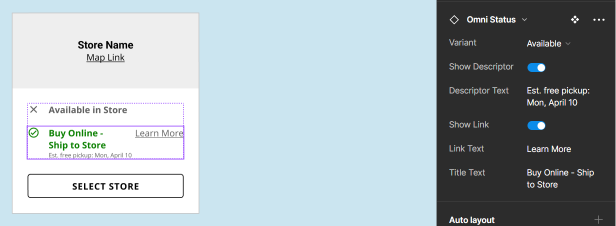
Component Variants with different Component Properties, such as Boolean & Content.


Larger Organisms contain a combination of Components and elements with variations in behavior and swappable Components to meet the needs of a specific use case or task.
Payment Selector
For our customers checking out, we wanted to reduce confusion around credit card/payment selection and expose alternative payment methods.
Timeframe
2019
Role
Sr. UX Designer
(Lead Designer)

I evaluated industry trends for payment selection in the checkout process. Most allowed the user to select the payment method in context of the main page without an additional click into a modal.

Our current experience required the user to open a modal to select a different payment method. Analytics indicated the users were clicking on the payment logos trying to select which payment they wanted to use.

Using the behavior observed by our analytics team and considering the industry trends, I created a new experience that enabled the customer to select the payment method directly on the page in context of the payment section.
I also enlarged the icons and unified their appearance with icon standards. Using the existing visual language in our design system, I created a Payment Tile Group component to support the new interaction.
The new design tested well and became our main experience for payment selection.
Visual & UX Optimizations
Over my career at A&F I was able to work on a multitude of smaller visual improvements and optimizations to the customer experience.
Timeframe
2016-2020
Role
Sr. UX Designer
(Lead Designer)
Footer

I worked with cross functional partners and evaluated benchmarks at the time to design a more clear and organized footer for the desktop version of the ecommerce website.
Language & Locale

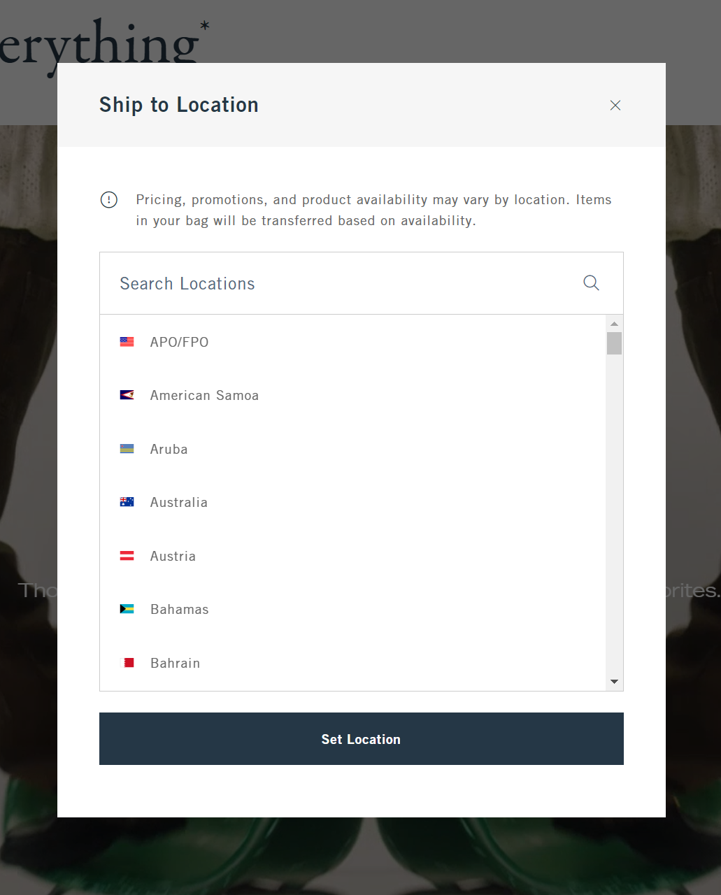
One of our key initiatives was to accommodate customers across the entire globe with one ecommerce website. In effort to support those customers, I designed the experience that enabled the customer to select their region and language from the beginning of the shopping funnel. It was important we allow for that selection as it impacted the inventory and pricing of items in the catalog. We also used common geofencing technology to detect where the customer was shopping from with as much certainty as possible.
Omni Channel & Store Location


As we broadened our omni-channel experience for our customers, it was important to have clear store locating experiences.
One of the challenges we had early on was customers selecting a sibling brand store such as kids, but then going to the A&F adults store to pick up their items. To reduce this confusing during the store selection process. I design Store Card components that had more clear visual distinction between the brands besides the logo.

For customer consistency and accessibility requirements, I made sure the design of the store search and selection process was consistent throughout the shopping experience. The main locator page, the product page, and the bag/checkout experience all used the same interface and components to find and select a store.

Account Information

At A&F it was important we maintain loyal customers and ensure an easier shopping experience. We supported that through profile management where the customer can manage their information and preferences. I designed the layout and form design as well as creating a workflow for updating addresses/payment information.

I designed the checkout preferences to allow for customers to store multiple addresses and payments but make a default selection for a more optimized decision making process at checkout.

Digital Returns & Exchanges
At the time, A&F customers who shopped online had no ability to return items online and could only go to a store to return or exchange items. Many of our online shoppers were not close to a store which made the return process very difficult for our customers.
Timeframe
2017
Role
Sr. UX Designer
(Lead Designer)
This was a large scale project where I partnered with a few UX designers and researchers. We collaborated with many cross functional partners and did intercept interviews with customers at our stores to better understand their needs or expectations for returns.


Our early concepts and UX flow informed the scope and roadmap of the large scale project that included a new Help section on our site as well as launching our first digital Returns and Exchanges experience.
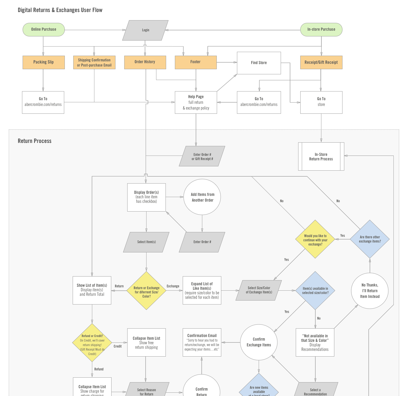
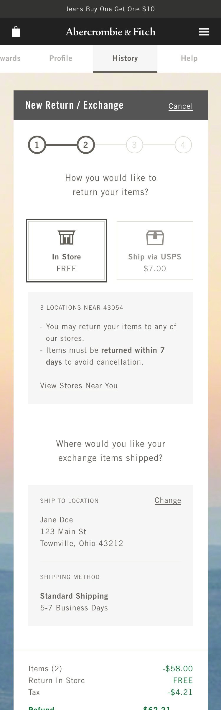


The concept design takes the user through a wizard like flow where they first can select which items they would like to return or exchange.


Within the modal for return or exchange, the customer is prompted to provide a reason for their return or exchange. We partnered with our store and merchant partners to align on the reason codes. In conjunction with that effort we updated the store POS to expose all the reason codes rather than be a default selection which incentivized the associates to make a proper selection rather than just leaving the default reason selected.
Below are the final designs that were informed by the concept and refined with user testing as well as our contemporary design language.


Once the user selects the products they would like to return or exchange, a summary is provided in context of each product selected. We also added a prominent progress indicator at the top to provide a clear visual of step they are on within the scope of the returns process.
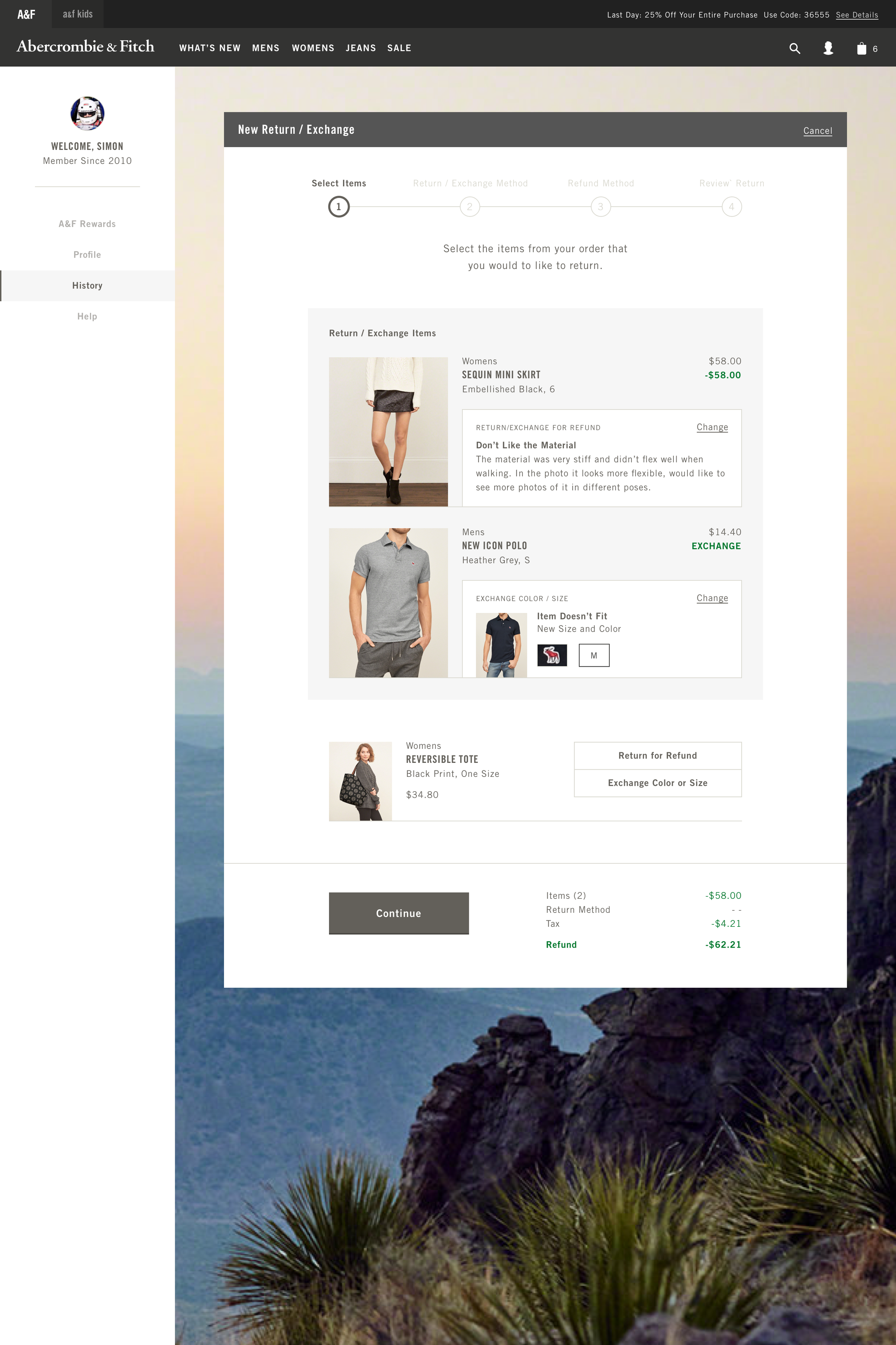

As the user steps through the process, the transaction summary is updated to reflect the users choices. We provide a comprehensive summary before they submit their return to provide the customer with confidence before completion.

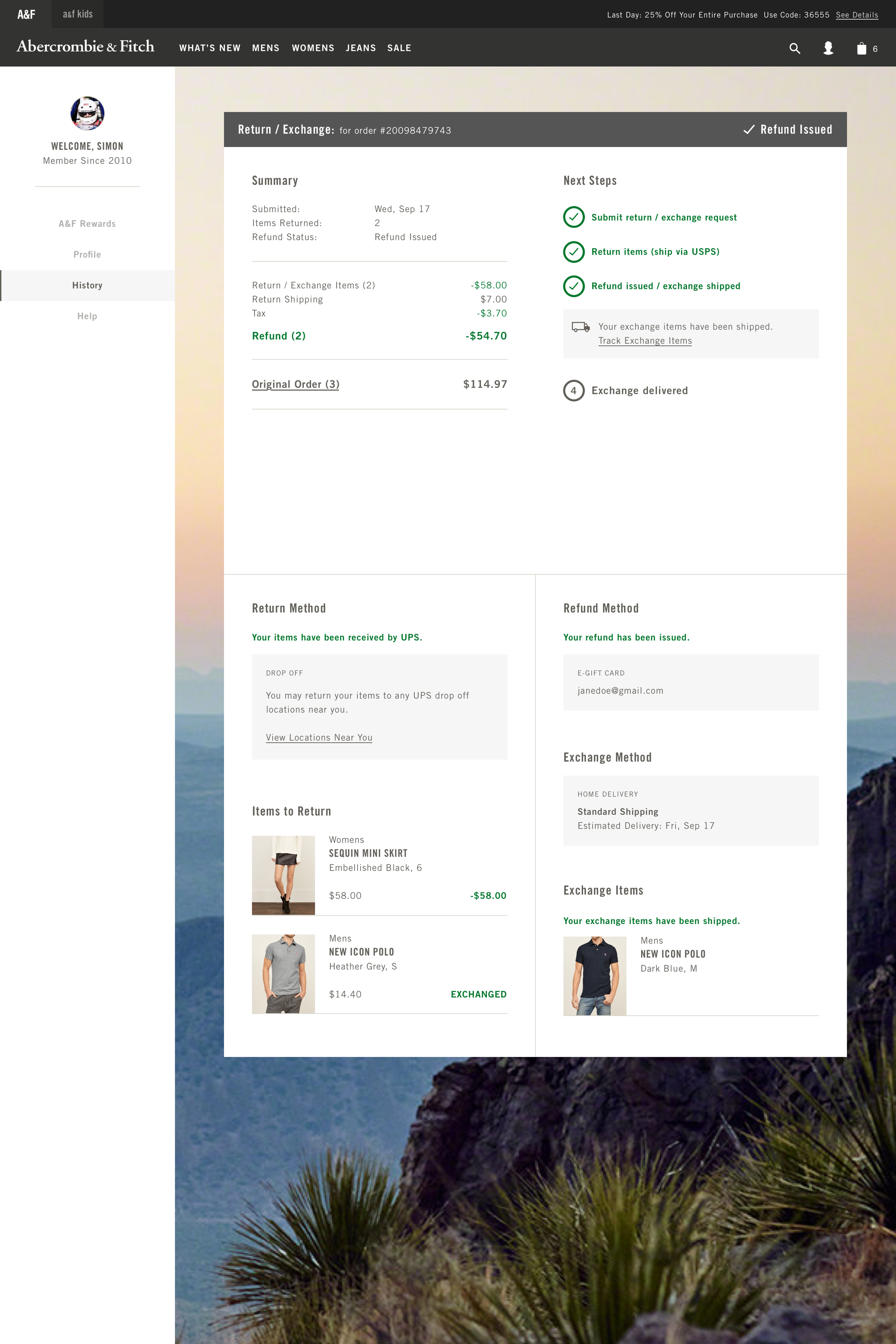
On submission of the return/exchange the user is provided a full summary with next steps outlined and the current status highlighted.

The project launched with overwhelming success and was one of my most significant projects at Abercrombie & Fitch. It was a great model for how a large scale, multi-year effort could be executed. We started with a clear opportunity, researched the customers needs/expectations, provided a concept that informed the scope, and then through the design process refined the experience with user testing and cross-functional alignment.
New Checkout
In efforts to provide a more flexible platform for testing and optimization, our teams redesigned and rebuilt the entire checkout journey for our customers. This was my first large scale project at A&F and eventually became the foundation for much of our online experience.
Timeframe
2016
Role
Sr. UX Designer (Support)
Our priorities were to design mobile first and optimize for our loyal customers by creating concise pre-populated view when we have all the user’s information saved. And progressively expose data entry for data we were missing.
This project was a major step for out team into the modern industry standards at the time. Designing mobile first, using responsive design to make the experience adapt to any screen size.
The system built to create the new checkout experience eventually became the foundation for our design system and great informed the design language at A&F for several years.


After the success of the new checkout experience we evaluated ways to include our bag experience in the new direction. I took some ideas from the team and experimented with a coded prototype of a unified bag and checkout experience with seamless transitions between the two.
The new checkout experience was an amazing project that required our design and development teams to closely collaborate on opportunities, constraints and the future of our brand’s design direction. It formed a solid foundation that we were able to expand on over many other projects and bring the overall web experience together through a common visual language.
When defining the style guide and standing up the design system, the elements in checkout were used as the starting point. It showed our teams how a well thought out design collaboration with cross-functional teams can have an impact far beyond the initial scope of the project.